Recreating an animated border effect
Published: 05-May-2025, by maardal
Technologies mentioned in this blog post
css
html
Introduction
Hi! Welcome to my series where I find elements on websites that I find interesting and want to try to recreate. It might be as simple as styling an image a certain way, or full page layout. The goal is to recreate it without looking at the original source code, so I get my creative juices going. However I’m gonna search for methods if I’m stuck!
In this first post I am going to recreate an effect I saw on Netcompany’s website.
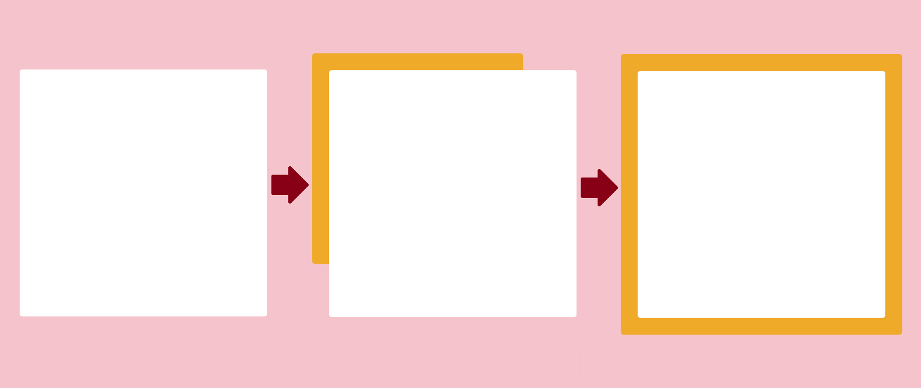
The effect
In this we have a square, and when you hover over that square, a slightly larger square, in a different color, grows from the top left corner down to the right bottom corner. All while being behind the smaller square. This makes a slick effect that I hadn’t envisioned before.

Shoutout to EzGif for the service of converting my MP4 files to gifs. I used them for all gifs in this post!
Figuring it out
My first thought is that this is two elements, one nested inside the other. The parent element first has a white/grey background, applied with a linear gradiant from top left to bottom right on one color. And then when you hover this parent element, we then apply a linear gradiant in the same direction but in different color. And then there is a transition on the linear gradiant. So that is what I am going to try in my first attempt!
I’ve never used a linear gradiant before, outside of indirectly using one in Tailwind I guess, so this will be exciting 🙉.
First attempt - Trying it out my first thought.
<main>
  <div class="container">
    <div class="child"></div>
  <div>
</main>
.container {
padding: 1.5rem;
height: 25rem;
width: 25rem;
border-radius: 4px;
background: linear-gradient(to bottom right, white, yellow);
transition-property: background linear 300ms;
}
.child {
background-color: blue;
border-radius: 4px;
height: 100%;
width: 100%;
}
.container:hover {
background: linear-gradient(to bottom right, red, green);
}This is the code I ended up with in my first attempt. This obviously only shows the declarations for the effect, and not any of the layout. If you’re curious about the full CSS, check out the CodePen further down.
We have the two nested elements, with classes container and child. The child element is a tad smaller, so we see the background of the container. Then I tried applying a linear gradient as background, and changing that background when hovering the container.
So here’s the result 🙈

This obviously did not work. First thing, the background property itself is not transitionable “out of the box”. Second thing, I came into the solution with a wrong preception of the linear-gradient function. I thought I maybe was able to transition between a “starting poisiton” to an “ending position” with the function, and the function would handle it all. Like for example:
So the function does not work like that, so I started googling about transitions with linear-gradients. I found some writings about using the before pseudoclass of an element to apply a linear gradient, and then changing the opacity of the pseudoelement and the main element, to transition between gradients. So that’s next!
Second attempt - Before pseduoclass and opacity
.container {
	height: 25rem;
	width: 25rem;
	border-radius: 4px;
	padding: 1.5rem;
	position: relative;
	z-index: 1;
	background: linear-gradient(to bottom right, white);
}

.container::before {
	position: absolute;
	content: '';
	top: 0;
	right: 0;
	bottom: 0;
	left: 0;
	z-index: -1;
	opacity: 0;
	background: linear-gradient(to bottom right, red);
	transition: opacity 500ms linear;
}

.container:hover::before {
	opacity: 1;
}

.child {
	position: relative;
	background-color: blue;
	border-radius: 4px;
	height: 100%;
	width: 100%;
	padding: 1rem;
	z-index: 2;
}
Above we see the CSS for the second attempt. The HTML remained unchanged.
As mentioned, we take use of the ::before class of the container. We make the container have a relative position, and then make the pseudo-element span the whole container element, by setting every of top, bottom, left, right to 0. We also ensure the elements have a z-index so that the child is in front, then the container, and the pseudoelement behind that again. Shout out to saVvy for this solution!
We also set the background’s of the container and it’s pseudoelement to their colors. Then when you hover the container, we change the pseudoelements opacity.
Lastly we transition on the opacity property to have a linear transition.
Spoiler alert! This did also not produce the effect I wanted.

So why did this not work? Again, I was still misunderstanding the linear-gradient function and it’s possibilities. At this point of trying this attempt out, I expected it would start filling the color from top left to bottom right. Alas, that was not to be.
It did however create a transition between the white and red background, so we’re closer.
Third attempt - Looking at the source code
For my last attempt, I decided to look at the source code. And good thing I did. If I had not I would have still been trying to google myself to an answer around making the linear-gradient function behave like I thought and hoped it would.
So how did they do it? Well take a look at the I made snooping around the source code, and what do you see?
<main>
  <div class="container">
    <div class="child"></div>
    <div class="grower"></div>
  <div>
</main>
.container {
height: 25rem;
width: 25rem;
border-radius: 4px;
padding: 1.5rem;
position: relative;
background-color: pink;
}
.grower {
background-color: red;
border-radius: 4px;
width: 0;
height: 0;
position: absolute;
top: 0;
left: 0;
transition: width 500ms, height 500ms;
}
.child {
position: relative;
background-color: white;
border-radius: 4px;
height: 100%;
width: 100%;
padding: 1rem;
z-index: 1;
}
.container:hover .grower {
height: 100%;
width: 100%;
}To my surprise, they did not use linear gradient at all. They did something much simpler. They had an empty element positioned under another element, with the z-index and absolute positon. They put it in the top left corner, with a dimensions of 0. Then, on a hover, they increase those dimensions so it fills the container, creating the effect of filling the container from top left corner to the bottom right corner. So simple🤯
I had not thought about playing with the size an “invisible” element and and placing it between two others. This also taught me that I could change a child element’s style when the the parent element is in a certain state, that being the hover state for the container in this case. Fancy!
Let us see what my final result looks like.
Final result

TADA! I made the thing 🤠 This was is a cool thing to have in the arsenal. Doing this taught me several new ways to do stuff.
Either way, below we have the CodePen for the whole solution if you wanna check it out. At the bottom I’ll write about what I’ve learnt doing this, but if you’re not interested in that, thanks for reading 👋
Codepen
What I learned
Just a quick list of what I’ve learnt in making this 🧠
- Going into this I thought that linear-gradiant was it’s own CSS property. It’s not, it is a function.
- Linear-gradiant function does not work with the background-color property, but does with the background property, amongst others.
- You can’t directly transition a linear gradient.
- If you wanna have a transition with linear-gradients, put two on top of each other and play with the opacity.
- You can style child elements, depending on the state of the parent element, that’s neat!
- To think of solutions that use the basics (like here, this solution is stacking elements and growing one of them)