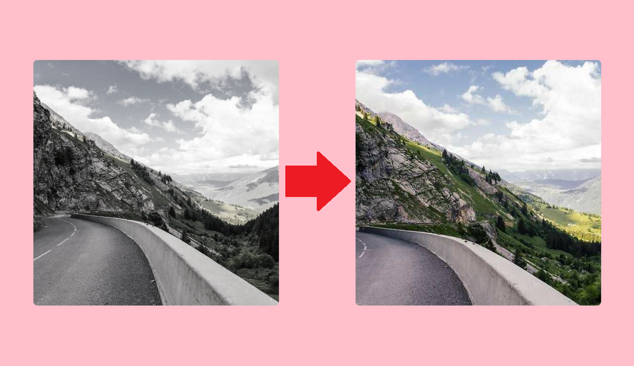
CSS Tips - Make images come to life with a saturate and scale transition
Published: 01-Apr-2025, by maardal

Introduction
In this solution we want an image that starts off black and white, and slowly fills with color and zooms in a bit, when we hover over it. We will use a mix of HyperText Markup Language (HTML) and Cascading Style Sheet (CSS).
This post is split in to two. First I will go through how to do it, so we get straight to the point. The second part holds the Codepen, and a little discussion on when to use this solution.
How To
First let’s go over the HTML.
HTML
<section class="image-container">
	<div class="image"></div>
</section>
The HTML structure is relevant here to show here, even though it is not very long or complicated. You may notice we don’t use an img element. Instead we have a div element in which the image will be added to with a CSS ruleset.
The section element will serve as a boundary for the image.
CSS
The CSS is slightly more work, but not a lot!
Setting up the image container
.image-container {
	width: clamp(100px, 90%, 500px);
	height: clamp(100px, 90%, 500px);
	border-radius: 8px;
	overflow: hidden;
}
In the CSS, we start by constraining the size of the image-container section, with a minimum of 100px and and a max of 500px. You want to chose a size that is smaller than your image, so the image won’t get streched.
We slap an overflow: hidden on as well. That is because we want this element to serve as the boundary for the image for when we zoom in on the image. Spoilers, we use the scale() function to make the zoom effect. Without hiding the overflow, the image would simply expand out of the boundary of the image-container section.
Adding the image
/* Adding the image as a background image.*/
.image {
	height: 100%;
	width: 100%;
	background-image: url(https://picsum.photos/700);
	background-size: cover;
	background-position: center;
	background-repeat: no-repeat;
}
Next we tackle the image element. We want the image to take up the whole of the image-container section. We do that by setting it’s height and width to 100% within it’s parent.
Then we add the image as a background image. I chose to use a service that will return a random image from it’s API. In this case it has a size of 700px by 700px, larger than what I set as the max for the image-container. I want the image to cover the whole of the .image element, so I set the background-size to cover. We then center it and tell it not to repeat. You want to apply these all the time, in case the background image we set is does not match the dimension we set in the image-container. Adding center and no-repeat, we ensure we get a section of the image covering the whole of the element.
Animating the image
/* The transition */
.image {
	filter: saturate(0);
	transition: filter 1s ease-in 0.2s, transform 1s ease-out 0.2s;
}

.image-container:hover {
	transform: scale(1.4);
	filter: saturate(1);
}
Now for the animation. We make the image appear black and white, by setting the saturation to 0. When hovered over we amp it back into it’s original color, by setting the saturation to 1. If you want a more dramatic effect, you can go higher with the saturation value.
Also we transform the image, by scaling it up by 40%. Remember, we hide the overflow of the image, so this will make the zoom effect!
Lastly, we then transition on the filter and transform properties, achieving and interpolation between the black and white image to the color image, and an interpolation on the scale of the image.
That’s it! Easy peasy.
Further reading
If you’re curious, I’ve added the Codepen I used for this blog post below. I also discuss when to use this solution. If you don’t care about that, then you’re done reading. 🙌
Codepen
There is a slight chance that the serivce used in the example returns a black and white picture. If you think this is the case, press the rerun button in the bottom right of the CodePen.
When to use
Since we’re not using an image element with this solution, it is most fitting to use it for cases where the images are not semantically important and purely for presentation. It could be remediated with adding ARIA-labels to the image container.